Microsoft
A deep review of iterations made to Microsoft’s Fluent 2 design system
Building A Design System
In order to showcase my learnings from class, I was tasked with building an iteration of Microsoft’s Fluent 2 design system in collaboration with 4 other designers. I served as the project manager and oversaw the management and progression of this project over the course of a 10 week sprint.
Jan ‘25 - March ‘25
Graduate School Project
Roles
Timeline
Project Manager
Designer
The Impact
Consistency Across Products
Our design system established consistency and uniformity among the components and technical specifications that will be used across all Microsoft brands.
Improved Scalability & Adaptability
New designers can onboard quickly, developers can implement foundations and components seamlessly, and assets have the ability to adapt to numerous screen types with a reliable and well thought out design system.
Minimized Design Debt
The potential for inconsistencies within designs is significantly decreased when a detailed design system is established and utilized.
Reduced Design Overhead
With established components and documentation for their use in place, designers save time on the design process and can instead focus on solving complex user issues and diving deeper into the development of new design strategies.


Values & Principles
Following the completion of a DesignOps canvas, we fleshed out Microsoft’s operating model in order to identify key design principles that embodied Microsoft’s overall goals and future expansion plans.
It became obvious to us that Microsoft’s strength is being seen as an authority on how future professions and organizations will evolve. The organization heavily emphasizes the value of new learnings and the evolution of up-and-coming platforms and systems. Currently Microsoft is betting on AI and cloud technologies as being the next industry game changer. This key observation heavily influenced the production of the deign principles showcased below.

“Microsoft’s products are guaranteed to adapt to each and every platform and user experience.”
“Microsoft’s distinguished reputation means it has a responsibility to be a leader in privacy and security.”
“Microsoft’s mission comes across very clearly across all platforms and products which is to be inclusive and facilitate community-building.”
“Microsoft’s image and identity is well-known and successful among users.”
Audit Discoveries
To measure the alignment of Microsoft’s current design system with the design principles identified, my team and I audited three Microsoft brands; Xbox, LinkedIn, and Copilot. The goal was to identify inconsistencies throughout the products design foundations and components that may influence a disconnect between the relation of the products. Microsoft is an umbrella company that houses many brands.
Do these brands all live up to Microsoft’s design principles? When users interact with these brands, are they able to identify that they are apart of the Microsoft ecosystem?
We identified the 4 takeaways listed below during this audit and utilized them to influence the iterations we made within Microsoft’s design system.
Xbox and LinkedIn exhibited significant inconsistencies in comparison to the overall Fluent 2 design system
LinkedIn has an overwhelming amount of asset variants
Various components failed to meet accessibility and adaptability standards
There was a lack of clarity and documentation on dark mode guidelines across the products which Xbox utilizes often
System Foundations
To maintain brand continuity, we kept Microsoft’s Fluent 2 typography, shadows, border radius, spacing, and grid styles as standard and utilized them to develop system foundations and components throughout the project.
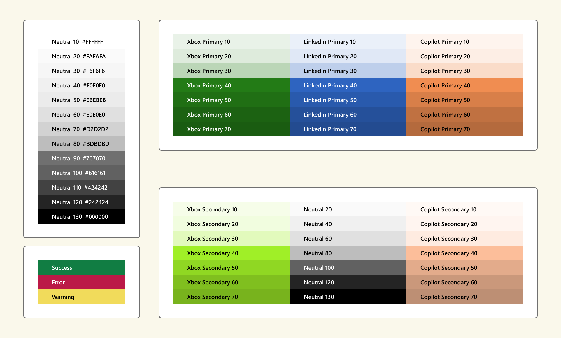
Color System
The updated color palette has been simplified to create a cleaner, more cohesive look. By focusing on fewer, more versatile colors, we’ve improved usability and accessibility while ensuring that the brand identity remains strong among Xbox, LinkedIn, and Copilot. This streamlined set will better guide users through the interface, helping them focus on key content while maintaining visual appeal.
We’ve balanced softer tones with stronger hues within the secondary palette to ensure these colors don’t compete with the primary palette, but still offer enough variety for secondary elements, such as buttons, icons, and highlights. The goal is to provide a functional yet subtle color contrast.
LinkedIn possesses a strong value behind maintaining simplicity within their color system. With this in mind, we decided to honor LinkedIn’s request by keeping their secondary colors as black and white. This selection is in place to prevent straying from the brands cohesive and easily identifiable brand image.
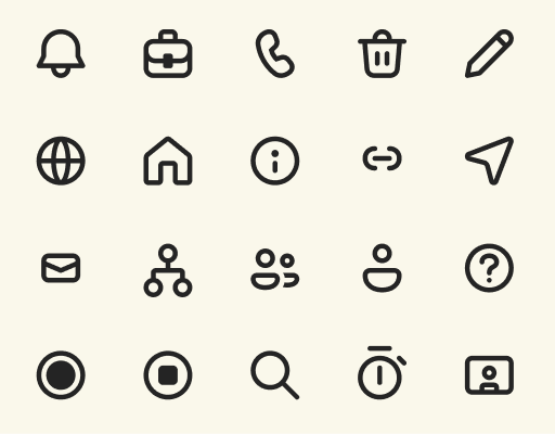
Icons
The Fluent System Icon set is derived from Microsoft’s MDL2 and Monoline icon set. With our design principles in mind, we wanted to maintain a memorable and distinguished look for the icons so we didn’t steer too far from the original icon set. Our main focus was maintaining the friendly and soft feel of Microsofts brand image by adding rounded corners and keeping the shapes simple.

Dark Mode
During our audit, we noticed that documentation regarding dark mode specifications was lacking from Microsoft’s current design system. Dark mode provides an alternative UI theme that enhances readability in low-light environments, reduces eye strain, and saves battery on OLED screens. Our guide defines how to implement dark mode while maintaining accessibility and visual consistency throughout brands.

Components
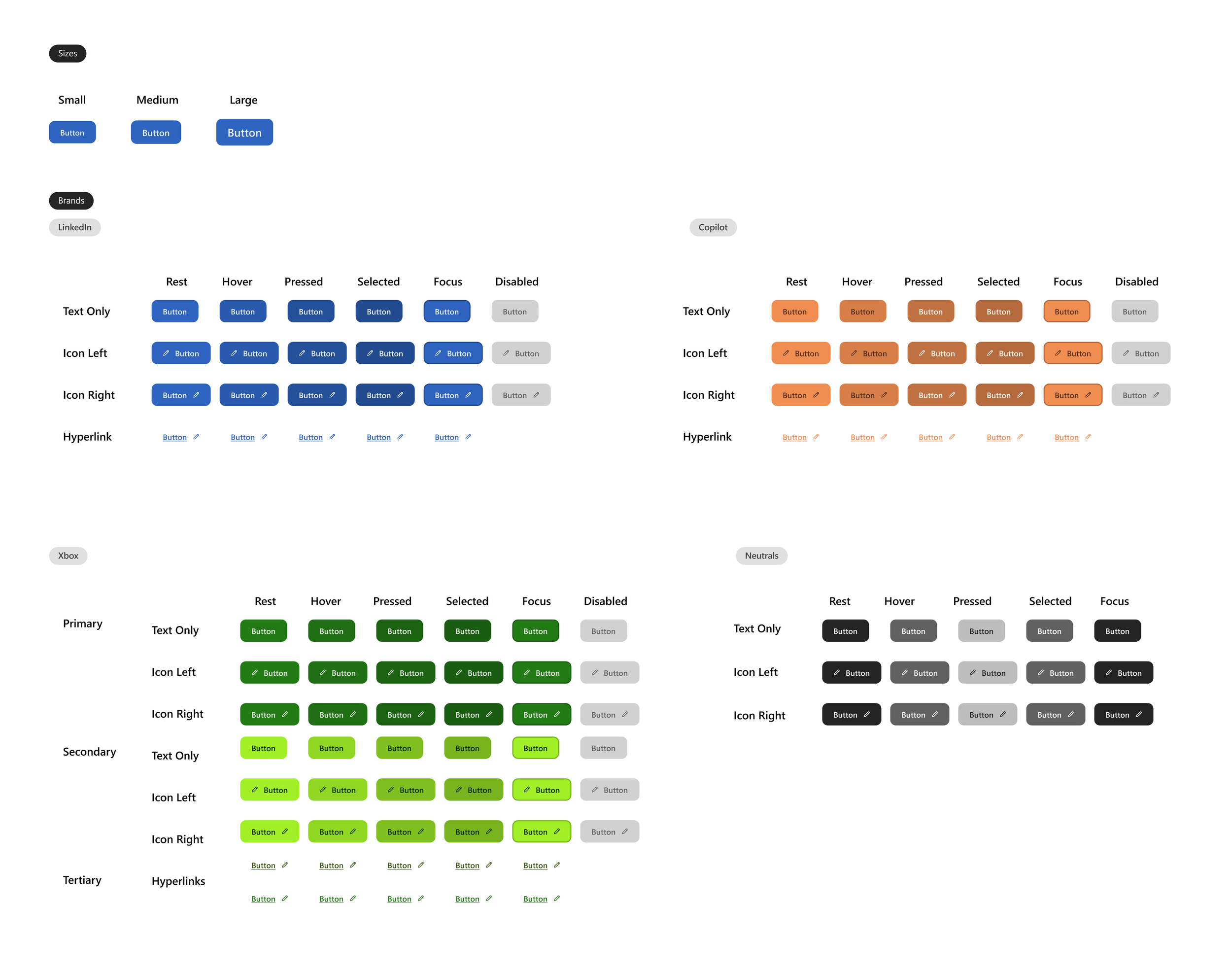
Buttons
We decided to design buttons that can be utilized universally across all Microsoft platforms for uniformity among all brands. This cuts down on design overhead and promotes overall brand consistency.
We focused on meeting WCAG 2.1 accessibility guidelines for the button variants. The final buttons utilize color pairs that meet contrast guidelines.
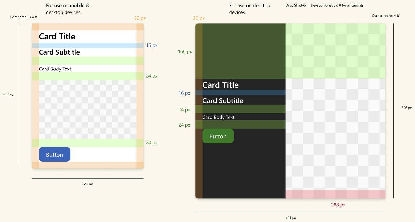
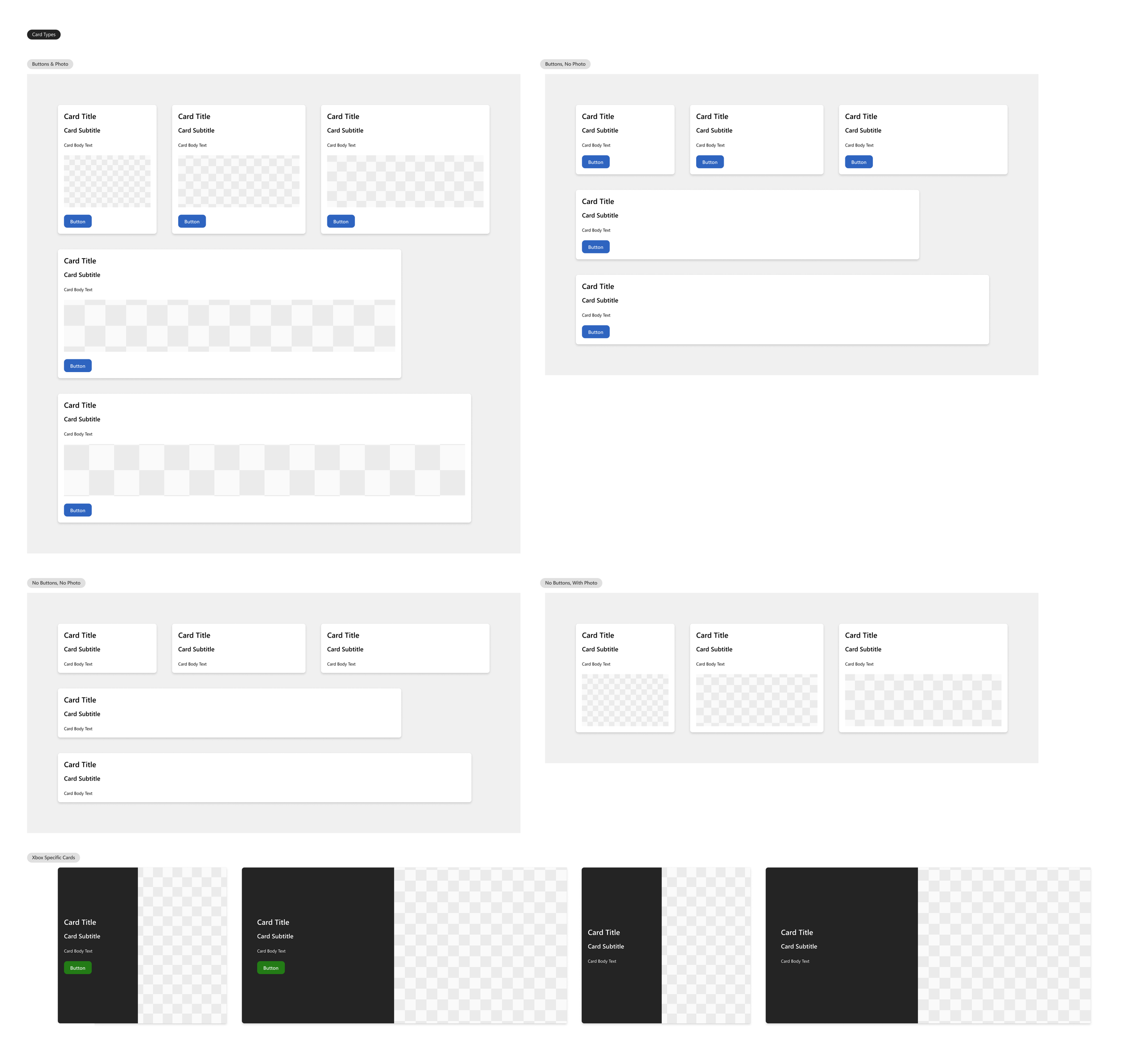
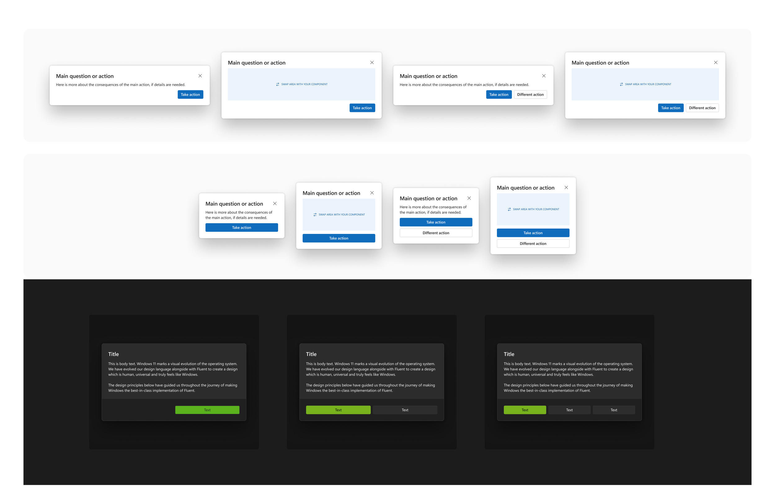
Cards
Microsoft utilizes cards to create structure and patterns within their designs. Our goal with designing these cards was to maintain this ideal while downsizing the amount of card types available as it may become inconsistent and disrupt patterns throughout all Microsoft platforms.
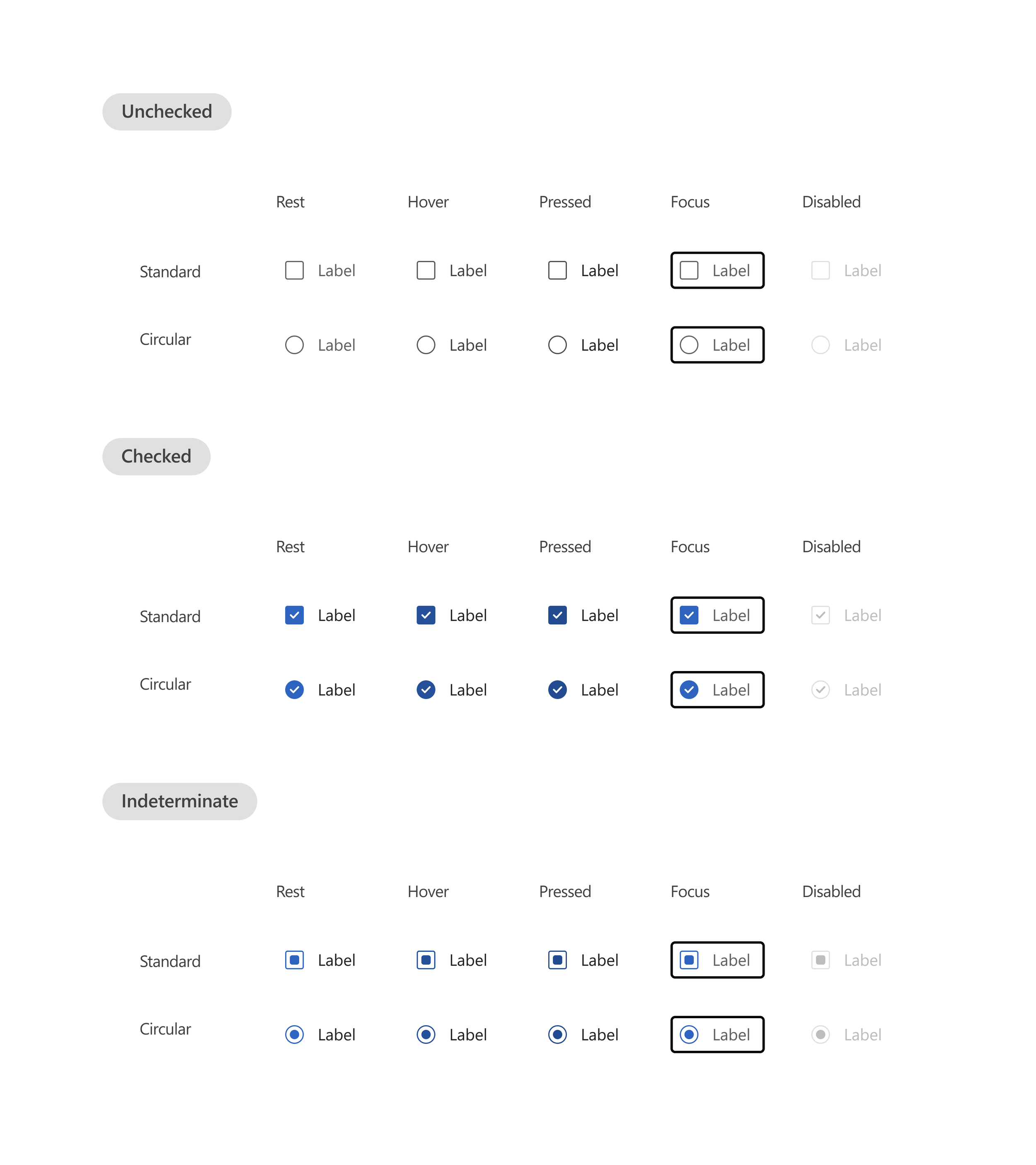
Checkboxes
To enhance its checkbox design system, we prioritized clear selection and maintained a simple aesthetic while addressing key areas for improvement. We increased spacing between checkbox options to improve visual clarity. Additionally we increased the contrast of accompanying icons to account for visual accessibility.
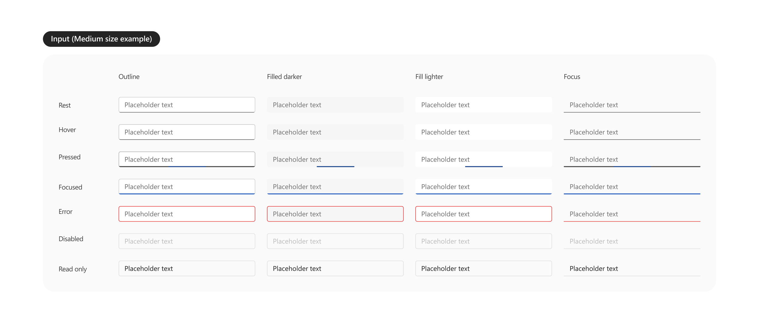
Input Fields
Dialog
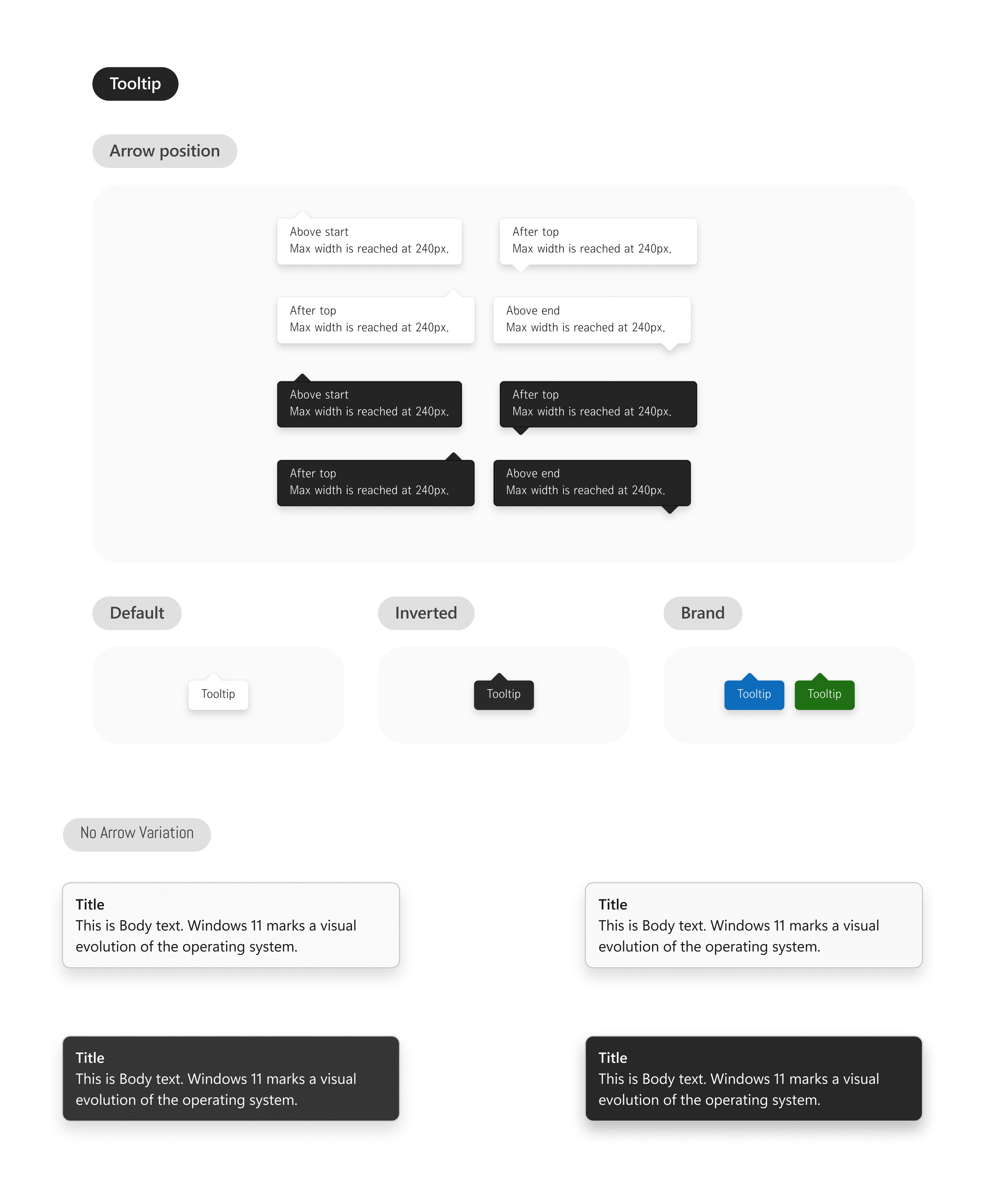
Tooltips
Our goal was to simplify the tooltip component while expanding its versatility to accommodate Xbox and Copilot Dark Mode. To enhance flexibility, we introduced varied tooltip arrow directions and an option to display a tooltip without an arrow, ensuring better adaptability across different UI contexts.
We focused on establishing a consistent set of input fields across Microsoft’s platforms, ensuring a seamless and familiar user experience across products. To accomplish this we standardized elements such as the border radius, font sizes, and button sizes. We also optimized placeholder texts within these fields for clarity and legibility. This comprehensive approach to input field design promotes a more intuitive and unified user interface across Microsoft's ecosystem.
Our goal with the updates to the Dialog component was to accommodate for variations commonly used in web applications. In most cases, the Dialog box was implemented with a single action button, making it the primary interaction method. By introducing the "different action button" as an alternative design, we reinforce this primary action while allowing for flexibility when multiple actions are needed.
Additionally, we saw an opportunity to expand the Fluent Web design system to include Xbox Dark Mode, ensuring consistency across platforms and improving accessibility in darker UI environments.
Badges
Microsoft utilizes badges throughout multiple platforms, however, they rely heavily on them for certain platforms while neglecting them in others. This inconsistency in the utilization of badges conflicts with Jakob’s Law. We believe that establishing badge components for the three platforms we are focusing on along with defining their use will aid in consistency across platforms as users navigate them.

Technical Specs
Technical specifications were outlined within our design system to ensure a smooth transfer to developers. Although Figma offers an option for this currently, our goal was to guarantee that all members of a design and development team would have access to technical specs as dev mode is currently a paid feature in Figma. Dev mode within Figma also fails to fully account for interactions between components such as various states of buttons (hover, pressed, focused, etc). Developers would have to search for these specific interactions within the document. Specifying this separately saves time for developers in the long run during production.